
2036 SÃO PAULO OLYMPICS
BRANDING AND PRINT CONCEPTS


BRANDING
The Olympic games are a global sports festival known for spotlighting various countries' unique cultures, skill sets, and arts. This project displays a theoretical brand identity for the 2036 Olympics if São Paulo, Brazil were to host it. It's goal was to reveal the environmental and artistic advancements of the city through its rich street art, bold architecture, and ambitious sustainability goals.
Logo


Made to resemble the Octávio Frias de Oliveira Bridge, this logo integrates the famous Olympian persona with the bridge's architecture.
Elements
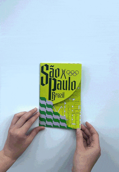
The architectural plans for one of São Paulo’s proudest environmental accomplishments, The Amata, are featured throughout the branding.


Colors
#CCDB29
#DBBAF2
#0AC242
#0AC242
#FFFFFF
The purple and green tiles reflect the stone paths that line São Paulo’s streets.


Typefaces

Gandur New (Semibold)

Gandur New (Light)

Gandur New bears resemblance to São Paulo’s graffiti and street art.

Redonda captures the city’s melting pot of new and old artistic styles coming together.

Redonda (Bold)

Redonda (Light)
Both typefaces were created by local São Paulo designers.